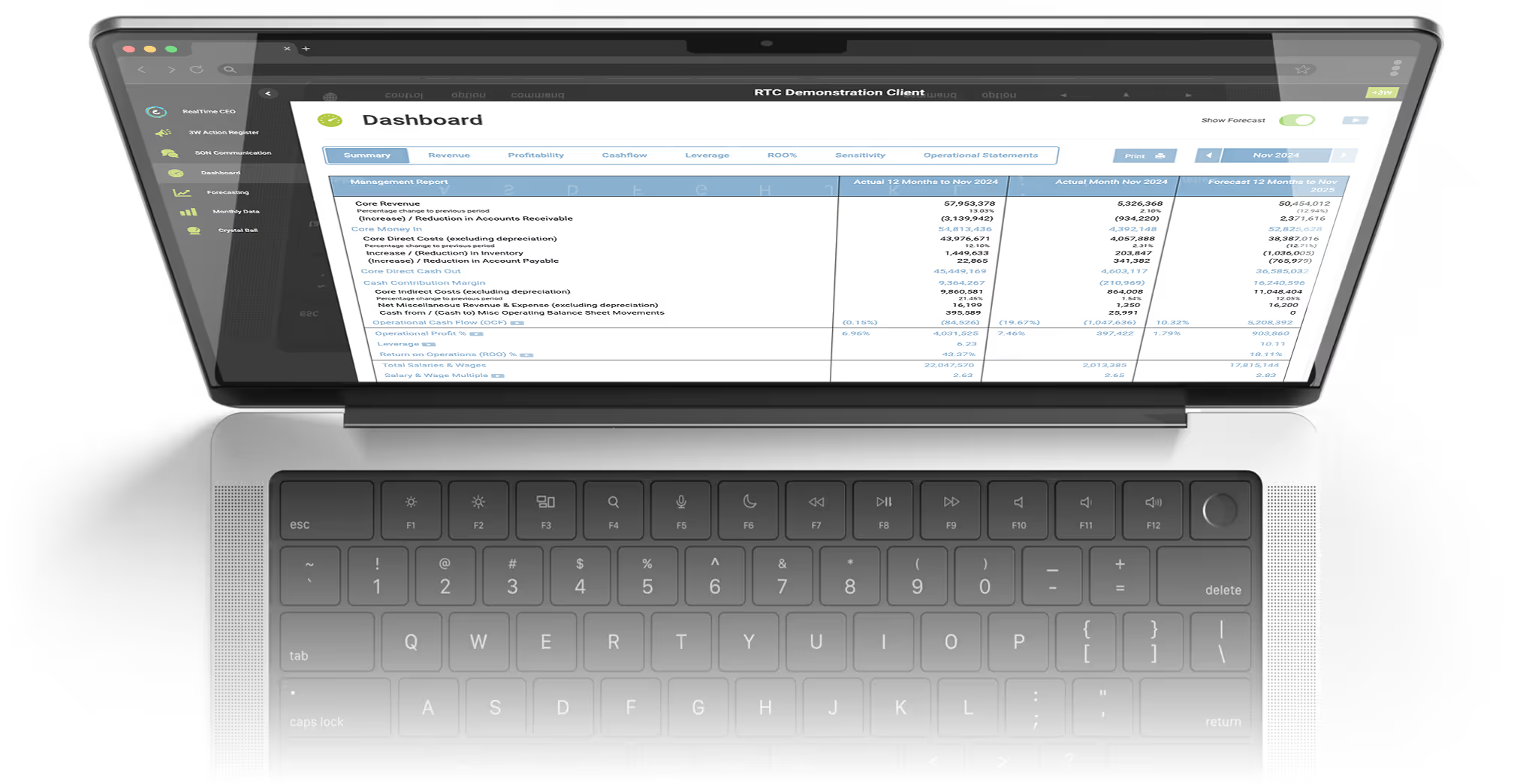
CEO-Driven Insights to Plan, Lead, and Shape Tomorrow
The RealTime CEO cloud-based software delivers the insight you need to quantify value and risk, plan strategically and communicate your exact position today and how that will change in the future.
Review your key business performance metrics
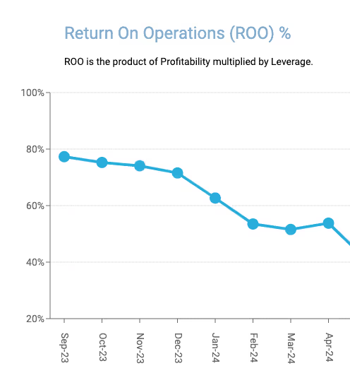
Return on Operations
ROO represents the interest rate the business is generating on the Operational Investment. It is the product of Profitability multiplied by Leverage.

Operational Cash Flow
Operational Cash Flow measures the cash generated by your core business operations, indicating your company's ability to maintain and grow its operational activities without relying on external financing.
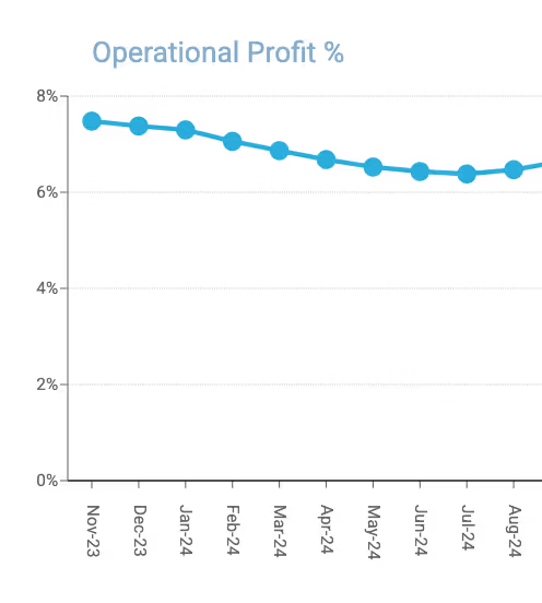
Profitability %
The Profitability % is a high-level measure that provides insight into the management of operational components of your income statement.
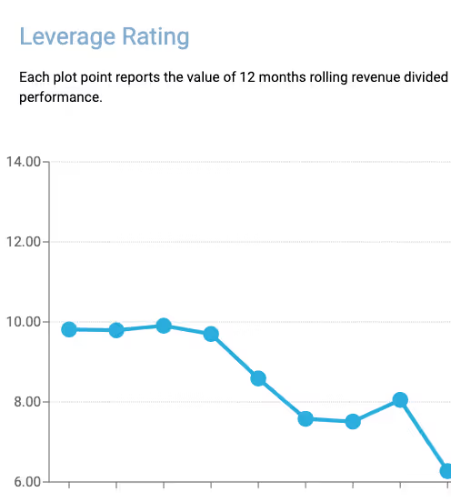
Leverage Rating
The Leverage rating is a high level measure that provides insight into the management of operational components of your balance sheet.
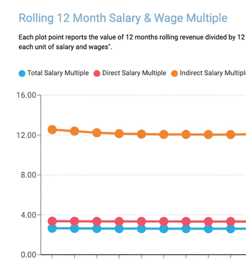
Salary Multiple
The Salary Multiple is an objective measure that tells you the value you are getting from your investment in people.
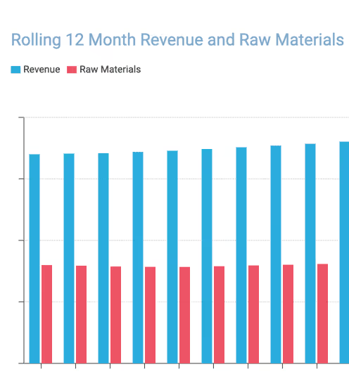
Raw Material Multiple
The Raw Material Multiple is an objective measure that tells you the value you are getting from your investment in raw materials.
Make the best business decisions, in RealTime
The software sits on top of your standard P&L and balance sheet to deliver a powerful set of data that will allow you to make the best business decisions, in RealTime, to increase the value of your business.


